
AdThrill is an advertisement insights platform geared towards college students to make a passive income. Users can watch and rate ads for cash compensation on their computer or mobile device.
The AdThrill team wanted to refresh their consumer website from end-to-end to give users a consistent and clean experience.
The original website was built quickly to get a product on the market, but now that AdThrill has a semi-consistent user base, they want to enhance the interface to provide their users with a cleaner, more user friendly experience.
How might we make the website more user friendly?
The website redesign was broken up into several sprints since this was going to be a full website revamp. Each sprint was ~2 weeks.

Are users able to navigate the current website with minimal issue?
College students
18-25 years old

The business owner collected user feedback prior to the project kick-off and this was used as a baseline for establishing a solution.
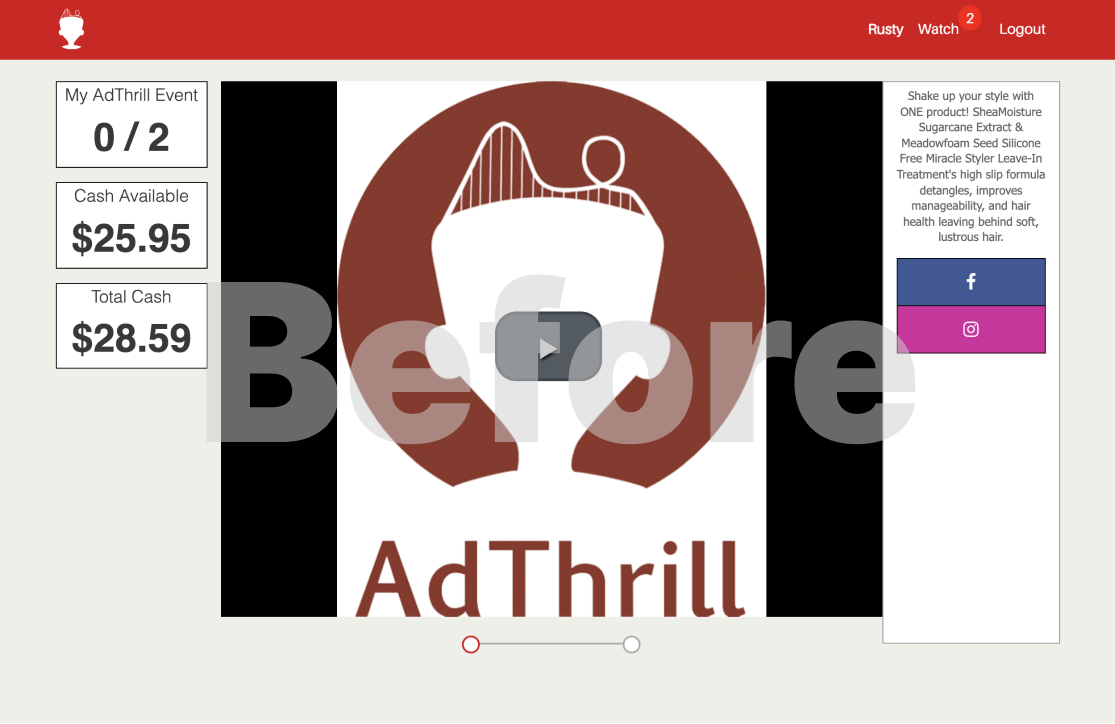
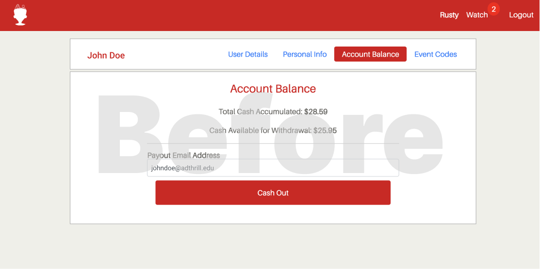
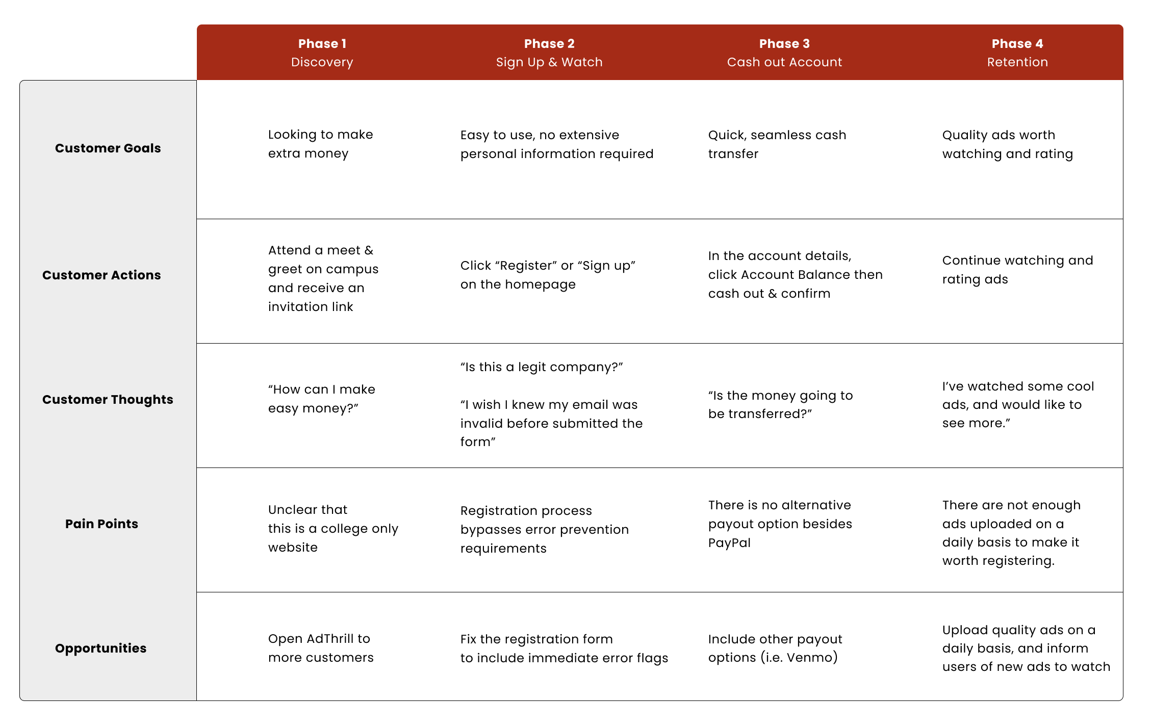
Users were unsure where their money would be deposited.
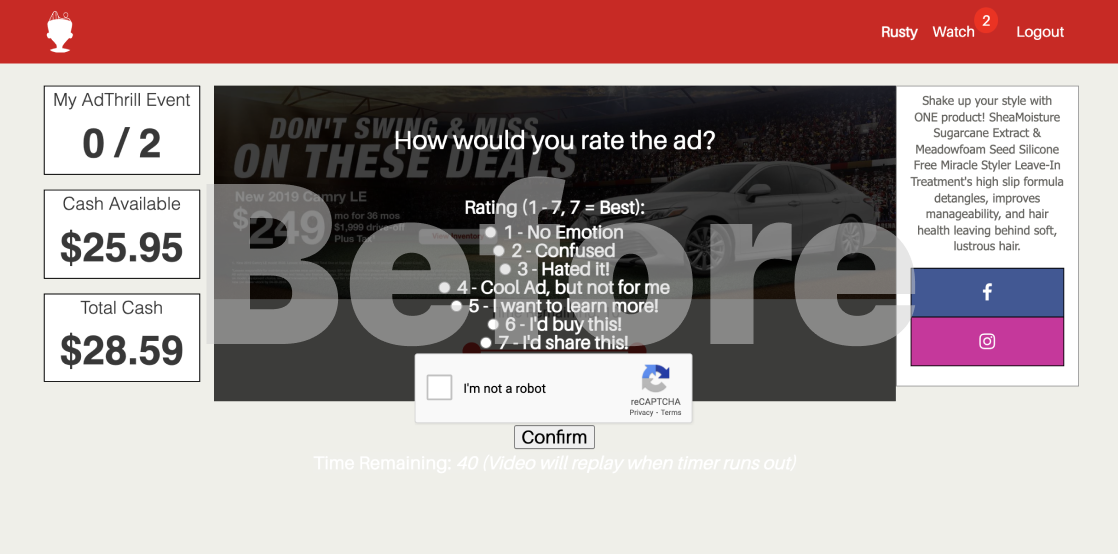
Usability heuristics were not implimented correctly.

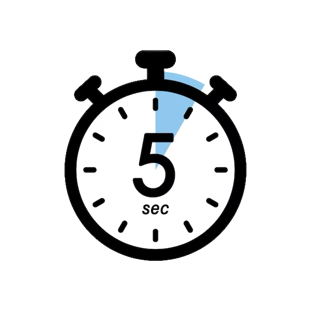
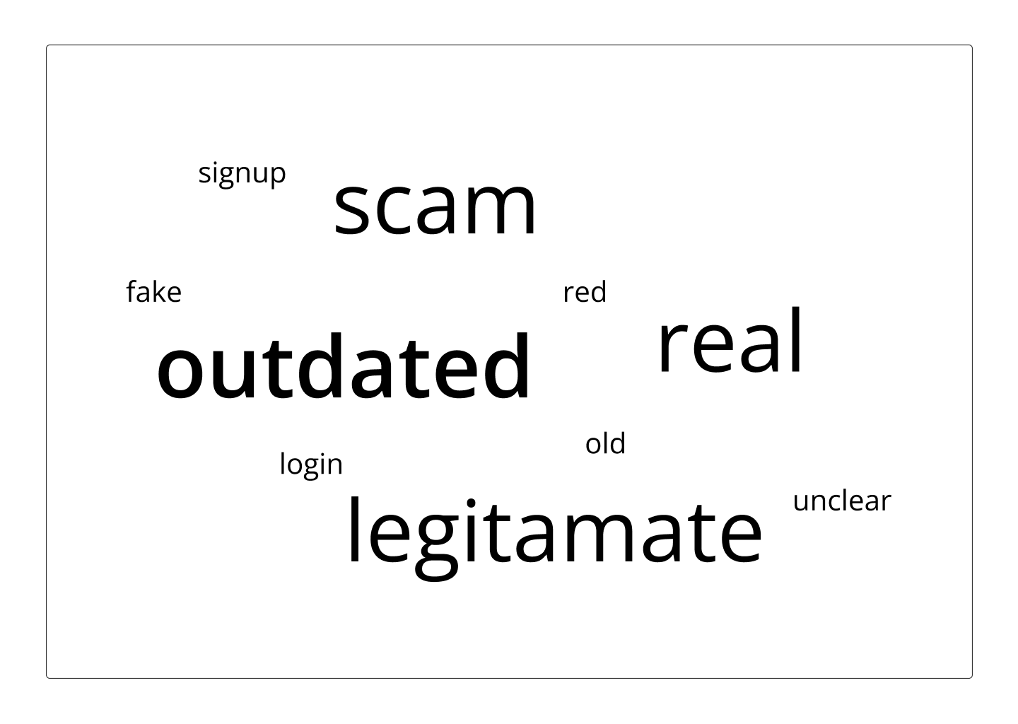
I was able to conduct a five second test with some of my peers within the age group AdThrill is targeting.
First impression of the website was that it was outdated looking.
Users did not believe that AdThrill was a legitimate company based on the interface.

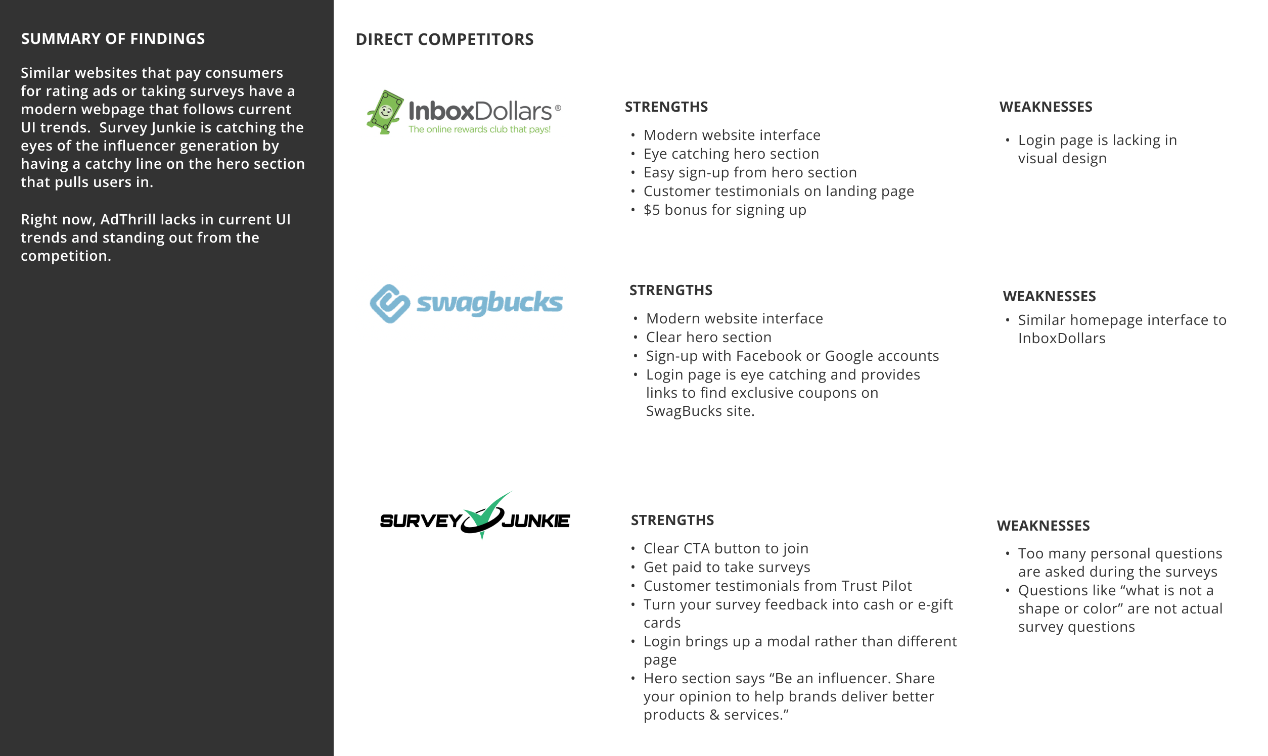
Since there was no budget to conduct full user research, I took some time to do a bit of side research to compare similar platforms.
Offer multiple avenues for payment.
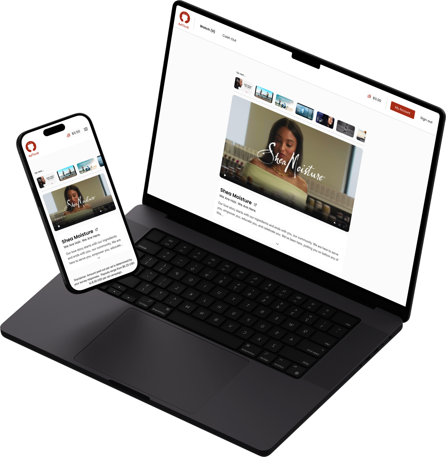
Update the entire UI to create a cleaner, more uniform look.

I took user feedback to outline pain points in the user journey through signing up to cashing out to returning to watch more ads.
Make it easy for users to watch ads. Avoid distractions or disruptions.
Make it clear that this is for students with active school provided emails.
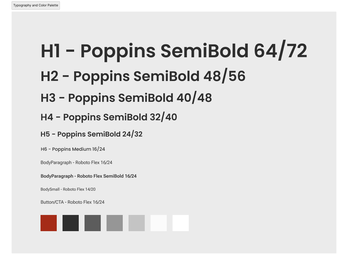
In order to approach the redesign correctly, I needed to create and establish a style guide.
AdThrill did not have an official style guide when they first launched the website. I created a complete style guide from scratch in order to give the website a consistent look and feel.
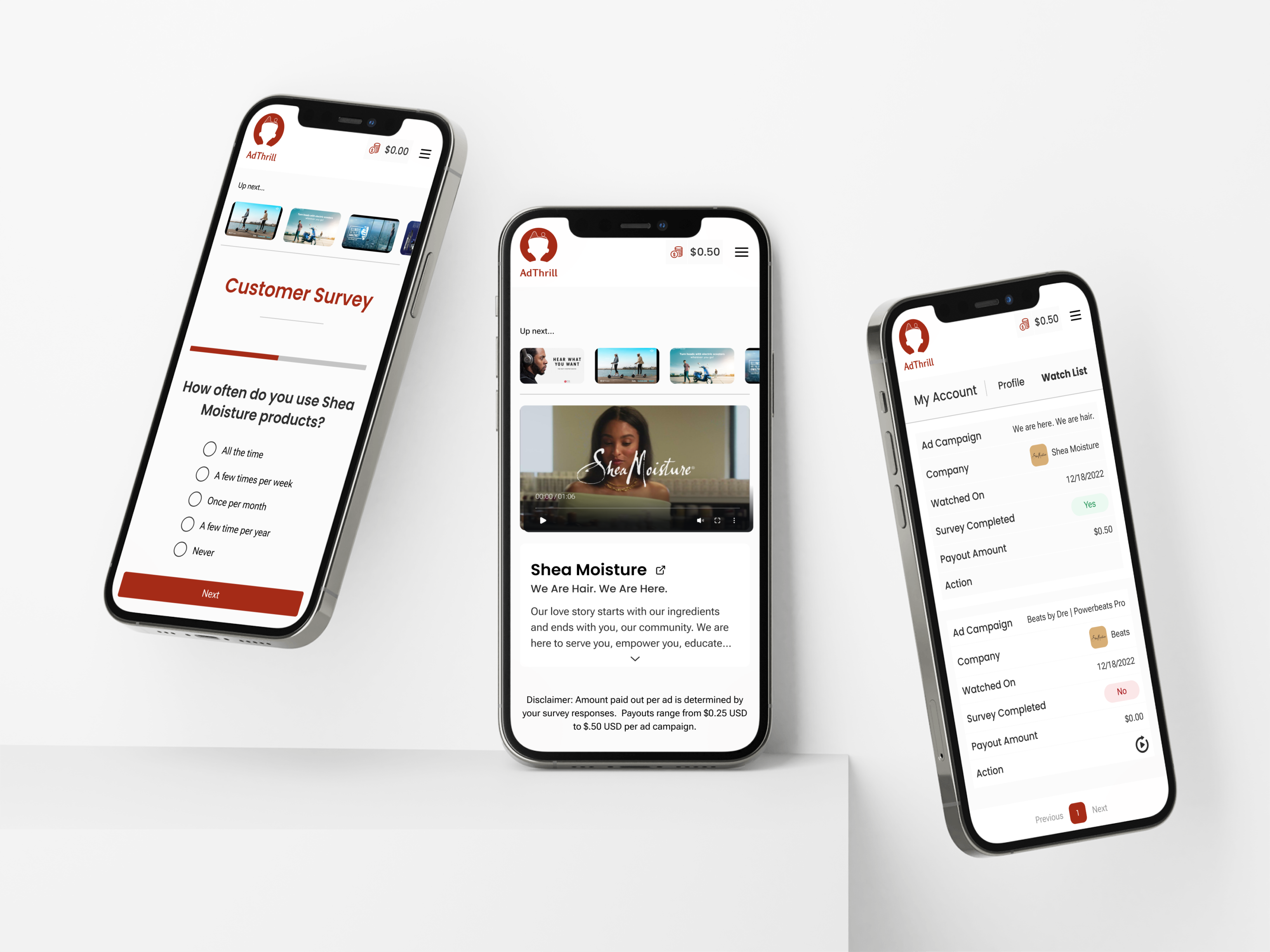
I started my designs with low-fidelity wireframes to illustrate the proposed layout of each page. These were presented to the business owner to make sure our vision is aligned.
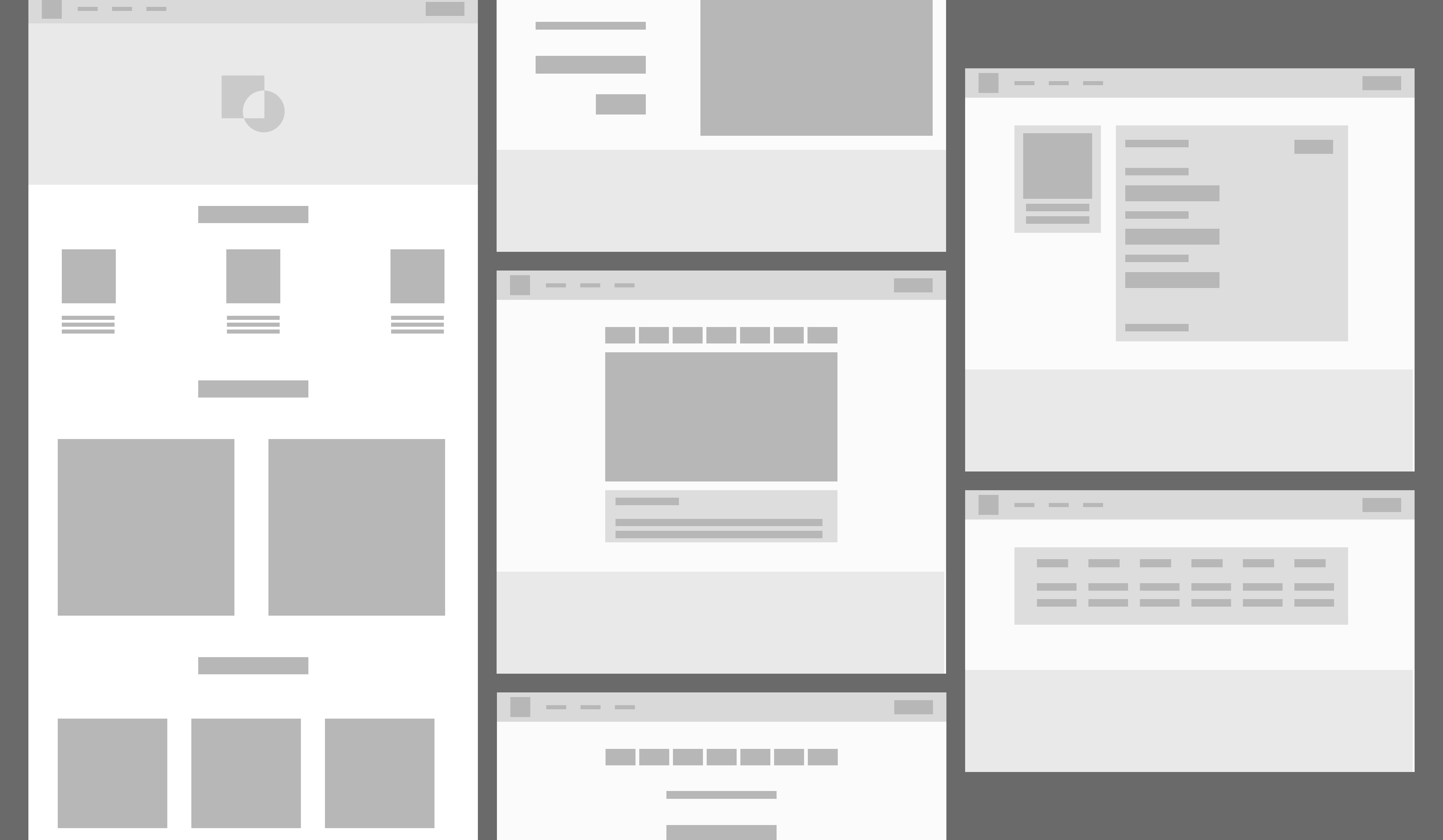
Once approval was provided to move forward with high-fidelity designs, I incorporated aspects of the updated style guide and marketing assets into the pages.
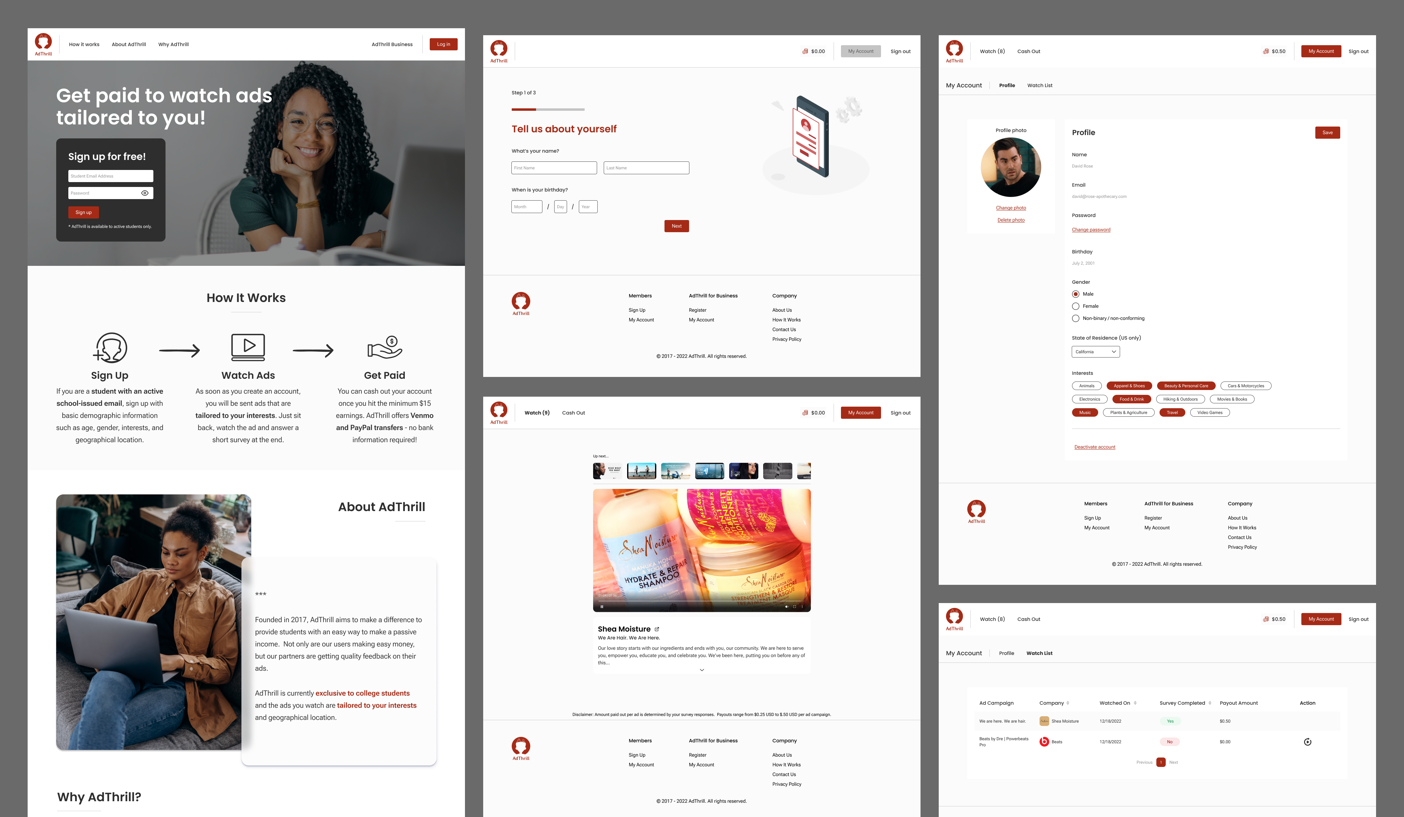
The redesigned interface will give users a consistent and updated feel so they know they are accessing a trustworthy website. User data will be gathered once the updates have been deployed to assess user satisfaction.
View Figma PrototypeView all projects