
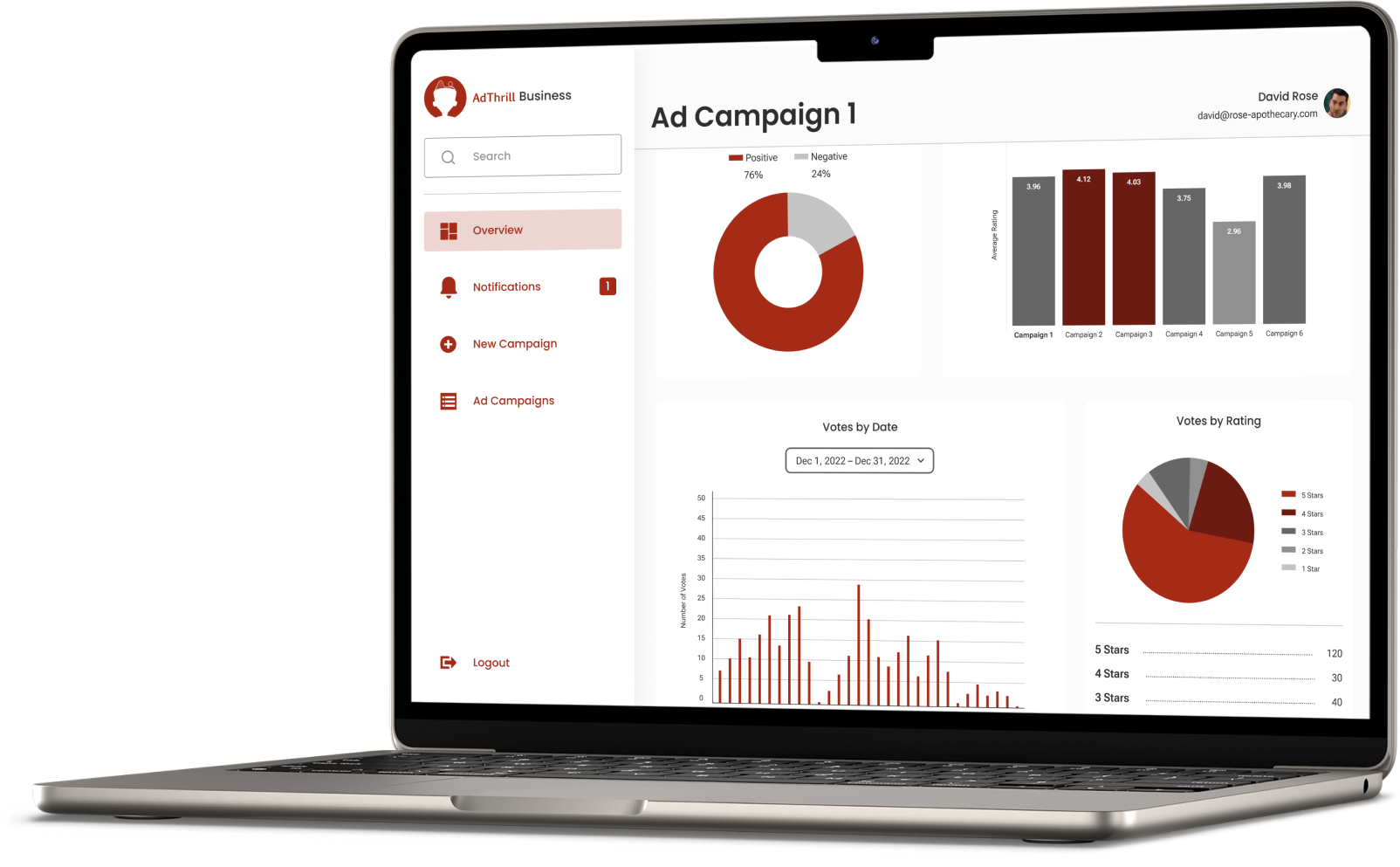
AdThrill’s business dashboard captures valuable analytics to enhance marketing strategies. Designed for Marketing teams, Product Directors, and Researchers, it serves as a centralized platform for professionals to analyze consumer data and optimize market research and advertising efforts.
How can we allow users to more meaningfully interact with their data?
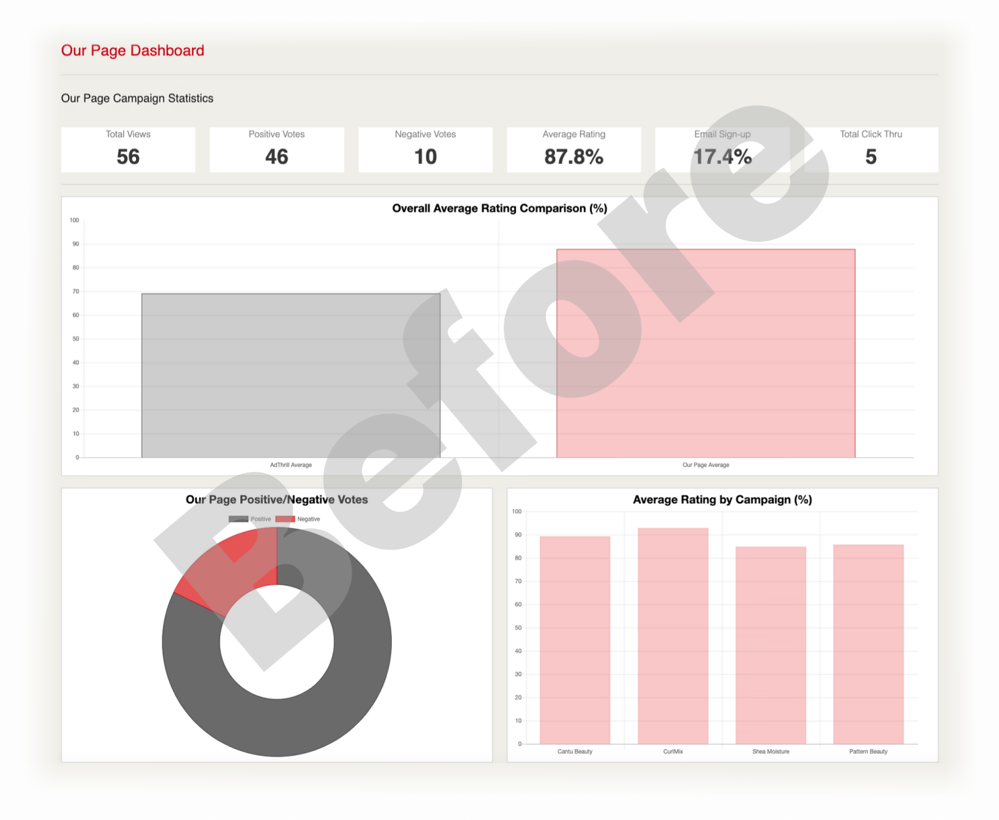
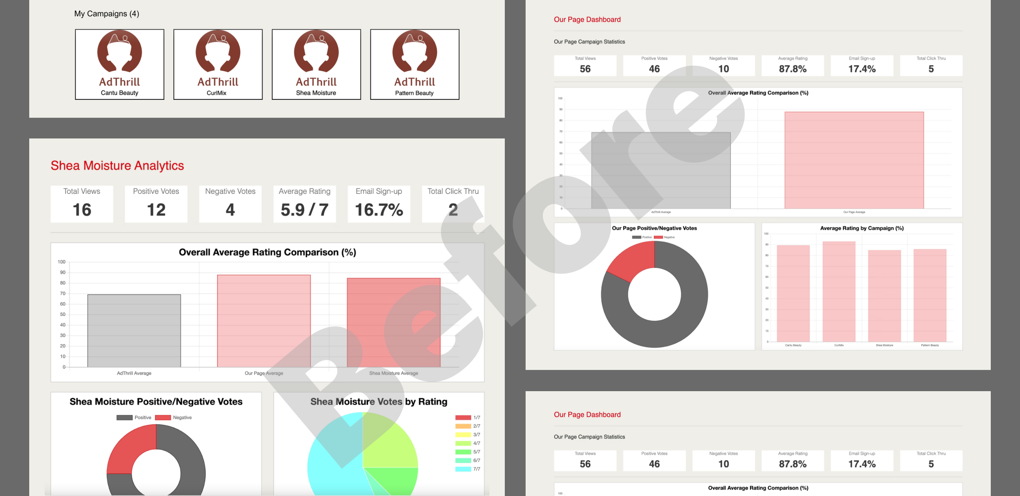
Users were only able to view their data at a high-level and not able to drill down into any details. Data was not organized in an intuitive way.
Make it so users can view data at a high-level, low-level, and anywhere in between. Also, providing more flexible filtering/sorting capabilities.
The dashboard redesign was delivered as a series of individual, usable milestones.
We wanted to ensure the dashboard functionality remained unhindered while deploying incremental changes.

Direct user feedback was provided to the business owner prior to the project kick-off, so this was used as the baseline for establishing a solution. Unfortunately, there was no budget for conducting user research at this stage.
Dashboard UI is outdated.
No ability to filter/sort data.
No filter feature to drill down the data.
In order to approach the redesign correctly, I first had to understand the type of data being displayed to the user.
The type of data I was working with was an overall comparison between different ad campaigns, number of positive versus negative votes, votes by rating, and votes by date. I needed to ensure the graphs displayed the data in a way that users could easily understand.
Before kicking off designs in Figma, I drew up some sketches of the layout of the new dashboard design for the priority pages. I then presented these to the business owner and lead engineer to kick off the discussion around expectations and feasibility.
Once approval was provided to move forward with high-fidelity designs, I incorporated the updated style guide into the business dashboard.
Final Iteration
Functionality for filtering/sorting capabilities were added to list of votes to improve a user's ability to access and manipulate relevant data.
This screen recording demonstrates the types of customization functions such as:
Filtering a graph by date
Filtering a paginated table by gender and rating
Sorting a paginated table by ascending date (earliest)
These enhancements enabled users to interact more effectively with their data, allowing them to customize views and analyze information from multiple perspectives.
View all projects